Monday, November 8, 2010

Christmas card giveaway!!


Once again Brittany from www.onecharmingparty.com has been generous enough to include me in her Christmas giveaway package! She has arranged to have 50 of the winner's Christmas cards addressed during the week of November 21-27. Head over to her website and leave a comment to enter the contest, then the winner should have their envelopes to me no later than November 21. The winner can pick the lettering style and ink color of their choice. A very generous offer from a fabulous party planner - seriously the projects I have worked on for her are just fabulous and the photos of her work are like eye candy!!! Thanks Brittany!!!
Thursday, September 23, 2010

Happy fall again!


I loved doing the job in the first photo! Brittany of www.onecharmingparty.com had all different colored envelopes with color coordinated stamps and inks for each (katie mash up). Beautiful attention to detail - I would have love to have gotten one of these invitations in the mail! And if you don't know, Brittany ran a contest on her blog last year with the prize being my calligraphy on your Christmas cards! A little bird told me she may be running the same contest again this year, so keep your eye out for that! The last two photos were for Kinley - we did menus (she added her monogram to the top before having them printed, which explains the large space at the top) and signs for family member's wedding photos to be displayed at the reception (flourish in navy ink)
This is my slow time of year - not as many people getting married in December and early January, so I see a slow down for a few weeks. If you are a spring bride and happen to have your invitations early, or if you would like to fit in Christmas cards, thank you cards, party invitations, or any other type of project these next few weeks are your best chance for squeezing in before my schedule fills up again. Happy planning!!

Happy fall part 2!


I love this first picture! Maria found blank playing cards and I added the guest name and the table numbers in the top and bottom corner like an actual card. So cute!! The second picture was for Michelle using the mash-up style in gold on stardream brown paper. What a color combination! Third is the newest style added - katie- for Meredith in grey ink. Katie was a custom style I matched for - you guessed it - Katie a while back and I pictured it on the blog. Since then I have had so many people request it I have added it as a regular style! Last but not least, the autumn style in brown for Tamara. Simple, classic, and very pretty!

Happy fall!


Well, thank you to all of the clients I have worked with over the summer - it was the busiest summer I can ever remember! I may not have posted much here, but I took lots of pictures, so please bear with me while we play catch up. :0) The first two pictures were for Barbara and Phil - we did a favor sign which we adorned with real starfish to match their beach theme, and some signs for their signature drink the Elaphantini! The third photo was some signage with more of Lindsey's gorgeous paper. And finally some seating charts, which I have not done that often in the past but I have had it requested more and more lately. The Goldmans were married on a cruise ship with a beach towel wrapped in some rope as their favor, so I used the rope to make two sailors love knots to decorate the top of the board. (They wanted everything clean and simple to counteract all of the color on the cruise ship...). Christine didn't have anything specific that she wanted to add so we went with a classic flourish with a gold accent to play off of the chocolate brown ink. For anyone interested - seating charts have a set up fee of $20 to measure out all the names and columns and such, and then .50 per name.

Monday, August 30, 2010

Twin Ravens Press


Hello all! It's been a busy summer - seriously the busiest I have ever had - and I have tons of pictures of recent work to post. Before I have a chance to do that though, I'd like to spread the word about a great little printing press in Oregon - http://twinravenspress.com/. I've had a number of clients who have worked with them before, and most recently for Cynthia who had me write out some pieces for her which Kristin of Twin Ravens was able to press onto the envelopes for her (pictured above). They were beautiful! She has been kind enough to link to my blog here from her site, and it is only fair that I do the same for her - and not just for payback! She is lovely to communicate with and the GORGEOUS pictures of her work that you can view on her site speak volumes for themselves. If you're in the market for some letterpress work, or you (like me) simply love to drool over pictures of fabulous wedding stationery head on over and check it out. You won't be disappointed!! :0)

Friday, July 2, 2010

New pictures - part 2!


The colorwork this spring has truly been amazing. I've never seen such a wide array of colors all in one season - it's been so much fun to work with! The first photo was really a blast. Lindsey wanted a style similar to the mashup - we used wispy lettering for the name instead of flourish and since she had long envelopes we were able to put the address all on one line below. The white ink on the red paper really popped, and bonus - see those gorgeous invitations? She handpainted each one herself!! The second photo was for Flavia. She had two diferent colored envelopes (greay and blue) for the outers - we used navy ink in wispy to do all the writing and added an apple green flourish to the inners to tie it all into the invitations. Gorgeous! Next was Stephanie in different shades of lavender. The writing is actually a very pale lavender in flourish and coordinates with the invitations nicely. And the last set is autumn lettering in silver ink on navy envelopes - I just love light colors on dark paper! Finally, in a July 1 post on www.beantownbride.com you'll see some stunning pictures of Lauren's wedding. Scroll down the pictures along the right side of the post and you'll see some nice shots of table and chair signs we worked on. A really beautiful wedding! Next week available is currently September 5-11, so if you're interested, let me know. Also, depending on how busy my fall schedule looks, I was thinking of running a Christmas card promotion - last year it seemed to be a big hit! Thanks for looking, and happy planning!

New pictures - finally!


I feel like I haven't posted new pictures in ages - here is just a taste of what I've been working on. The first shot is a birthday invitation for a three year old. The envelopes (smoke & track included) were all done by me, and they were so cute all lined up on my table that I had a very hard time packing them up to send them away! So cute Lindsey!! Second picture was a custom design for Laura, who wanted lots of swirls. Third set also a custom style for Katie - I like this one so much I may play around with it and offer it as a regular style. Fourth picture is part of the butterfly phase. The butterflies themselves were placed in champage glasses, and Melissa actually sent me some really great pictures of them all set up as well. Butterflies were very big this spring - I had another set of white cards with butterlies stamped out along the top that I used coral ink on - very light and fun! (Don't have a picture though - boxed them up before I remembered...) The last shot was a custom designed monogram for Michelle's placecards and menus that she had printed. Really like how the monogram came out! Blogger limits me to 5 photos per post, so onto the next one I go...


Tuesday, April 13, 2010

Placecard season in full swing!


Now that spring is finally here I have had a rush of placecards to complete along with all of the envelope work. Here is just a quick sampling - though I forgot to photograph Desiree's that I sent out today with the adorable wildflower seed cutout attached! The first photo was for Amy on beautiful Vera Wang cards (done in flourish, black ink). The second set was for Courtney (swirl lettering, pink & brown ink, on brown and pink paper, respectively). We did the names on the outside of the escort envelopes and the saying 'Love always. Dance tonight.' on the front of the tented card insert (the table number went inside the tent). I did matching table numbers with the phrase as well, and I can't wait to see the professional shots! The last picture here was for Amy (flourish in magenta ink). Magenta has been a great color this season - love it!

Friday, April 9, 2010

Away for the weekend!


Taking the weekend away to go to a wedding as a guest! Should be back sometime early Monday (and because I couldn't resist, here's a shot of the wedding card...) Congratulations Jaci & Geoff!

Friday, March 26, 2010

So many fun colors this season!


It's really amazing to me to watch the trends that unfold season after season. Last fall it was all about navy blue, and then over the winter I used almost every drop of gold ink I had in the house (And there were plenty of gold envelopes as well!) This spring it is all about color - ANY color. Bright and bold, or soft and muted. And it's such a treat to work on them! The first photo here was done in all lowercase to match the rehearsal dinner invites for Rona. The second set comes from www.sarahdrakedesign.com for Lindsay. Love that pink! (Formerly fine script lettering - now called autumn!). In the third photo we used the mash up style in a baby pink to match the naming ceremony invitations for Paula. The last two photos were placecards and table name frames for Jenn. I LOVE the combo of the blue and green together. (It was night when I took the picture, and terrible lighting, but the colors were stunning together!) I can't wait to see the preofessional shots of those! Keep those colors coming!


Wednesday, March 24, 2010

Updated samples - finally!


Hello, and happy spring! So I have finally updated my samples. Some are old styles with new (hopefully simpler) names and some are new styles altogether. The next weeks currently available are May 16-22, July 11-17, July 25-31, or most weeks after that. Happy planning!


Thursday, March 11, 2010

New style - mashup?


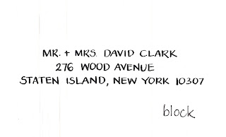
This is a combination of styles that I have been using more and more recently. The name is in the alt caps lettering style and the address in the block CAPS style. It is especially great when you have invitations that mimic the style - and so many of them do, with the bride and groom's name in a script and the remainder of the invitation in block. It's a different look, and I quite like it - if it catches on I will offer it as a regular style!

Fun colorwork


Hello! Well, the virus has *mostly* been resolved, so while I have a quiet moment, here are some of the paper and ink things I've been working on. The first was a sign to adorn a getaway golf cart for a Florida wedding - I matched the details from the table cards to the sign. (Sorry it's rotated - that's another whole issue...). Can't wait to see the finished cart! The second set was actually much brighter than it photographed - a lovely bright hot pink that was so much fun to work on for Stephanie! (fine script, black ink). The third set was alt caps lettering and a custom mixed green ink to match Cindy's invitations. I always love working with light ink and dark paper - so pretty! (And while the invitations were not mine to show - they were GORGEOUS! Check out www.letterpunchdesign.com ....) Finally a mix of gold and navy blue fine script lettering to compliment the icing on Regina's envelopes. The spring always brings out the creative colorwork. There's been a lot of gold lately - I think that may be the 'it' color so far this year. Happy planning!