
Wow, all these blog mentions and the fame will go to my head! ;0)
So much fun working on these envelopes - I'll say it again - I LOVE white ink on dark paper. Always, always so pretty. These were for 'Miss Candy Apple' of Weddingbee - thanks again for sharing this 'Miss Candy Apple'!!
http://www.weddingbee.com/2011/08/11/a-candied-invitation-part-i/
Thursday, August 11, 2011

Friday, July 15, 2011
Wonderful blog mention
http://www.stylemepretty.com/2011/07/15/tribeca-rooftop-wedding-by-bespoke-affairs/
Years ago now (has it really been that long??) Adrienne was a bride of mine having her invitations addressed. Now she is a full on fancy schmancy event planner: http://www.bespokeaffairs.com/ . Here is a job I worked on for Heidi, a client of hers, and both the envelopes (which are not pictured on the link, but you can scroll down and find) as well as the placecards and the table cards were just SO COOL! I loved working on them, and I loved being included in the blog post - such an honor to be a part of such a very beautiful wedding!
Years ago now (has it really been that long??) Adrienne was a bride of mine having her invitations addressed. Now she is a full on fancy schmancy event planner: http://www.bespokeaffairs.com/ . Here is a job I worked on for Heidi, a client of hers, and both the envelopes (which are not pictured on the link, but you can scroll down and find) as well as the placecards and the table cards were just SO COOL! I loved working on them, and I loved being included in the blog post - such an honor to be a part of such a very beautiful wedding!
Tuesday, June 14, 2011
Silver and white signage


Love the white lettering on shiny silver paper - very elegant. The top photo was actually their vows, written on 5x7 paper on the diagonal. A challenge to fit it all, but very cool in the end.
Apple green and white! (oh, and purple!)


Top to bottom - baby shower invites for my sister in green ink, wispy lettering (invites from Vista Print - LOVE them!) , autumn lettering and white ink on beautiful green paper. This was a striking combo in person! Next a flourish mash up on purple envelopes, and more apple green ink, wispy lettering...
Come on blogger - let me post pictures!!


Finally! Top to bottom - wispy lettering in an apple green ink (hard to tell from the lighting, and perched in my Easter flowers), really cool seating chart done in purple ink, autumn lettering with rhinestone embellishments,
navy placecards (that I forgot to rotate) in an autumn mash up (love these!), flourish on navy in white ink (navy/white is popular this season!), and some insert cards in an autumn mash up that were very neat looking.
Thursday, June 9, 2011
So many new pictures!

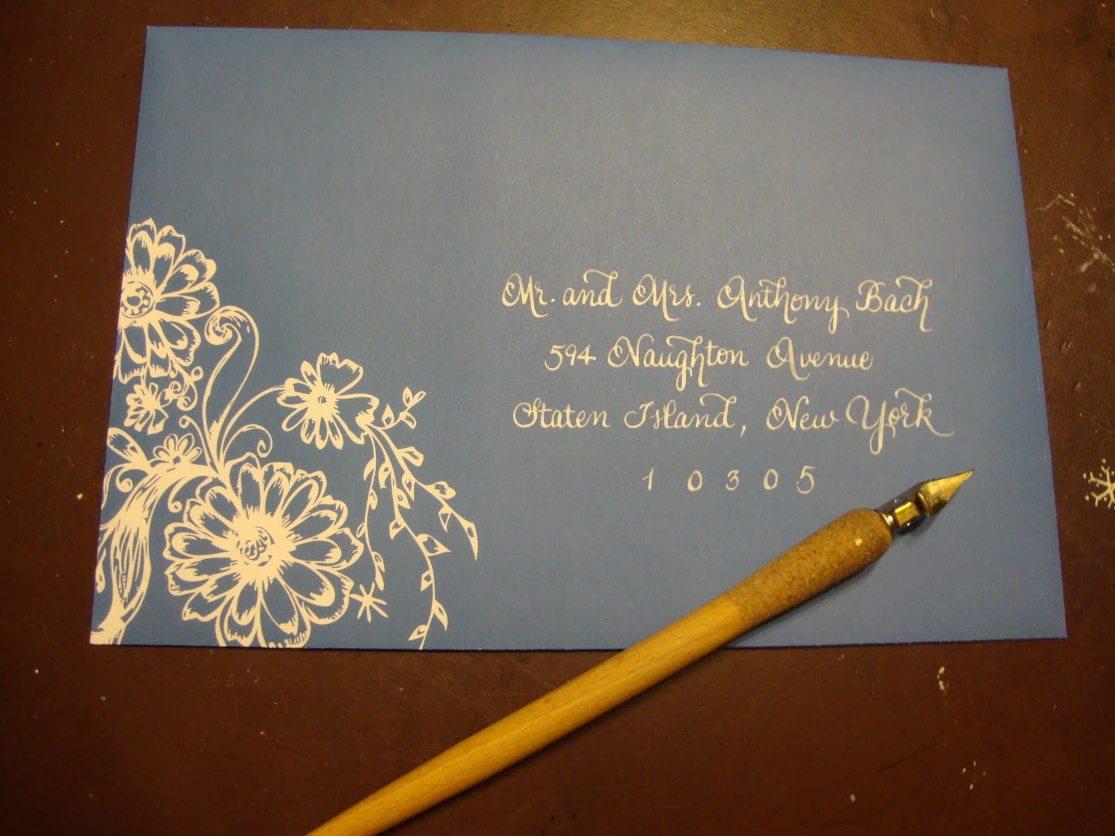


Finally got the pictures off of my camera and onto the computer. As my kids get bigger and involved in more activities I've had less time to post pretty pictures, but I am still as busy as ever! Without much commentary, here is just a bit of what I've been working on... Top to bottom they are wispy, flourish, wispy, swirl, and an older style wchi I believe I called non-italic.
**I have lots more pictures, but blogger is giving me a hard time starting a new post and they limits photos to 5. I may have to try again later!
Friday, February 4, 2011
Lovely post on weddingbee.com
Thanks Stephanie! You took some beautiful photos - I just wanted to share!
Addressing and Obsessing Weddingbee
Addressing and Obsessing Weddingbee
Subscribe to:
Posts (Atom)