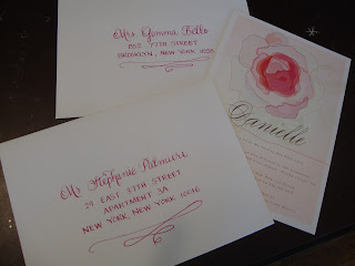
Hello to anyone who has found their way to his blog! Be sure to take a look at the following 6 posts - there are lots of new pictures of just some of the things I have been working on over the past year. During the busy season I don't always have time to update so often, but between now and the end of the year my schedule typically lightens up quite a bit. If you are looking to have holiday cards addressed, or if you are having an early spring wedding, now is the best time to have them done! Feel free to contact me with any questions at all or to let me know if there is anything else you would like to see.
calligraphybymichele@verizon.net
Friday, October 12, 2012
Some new styles
Some new things that I ended up liking! The first is Heather again, which I mentioned in the previous post. If I get around to making up the new samples sometime soon I think I am going to include this one. The second is basically just the mash up, but it was so fun to have the names on the diagonal! And in the bottom photo we just added a swirl below the regular mash up.
Seating charts
Seating charts are always a nervewracking challenge, but the result is always so worth it in the end. For the first two charts, the brides supplied the stalks of silk flowers and I separated them into individual blossoms. and hot glued them. Both brides chose to have letter stickers (rhinestones/glitter) and the extra embellishments were worked in as they fit. There is a lot of math and measuring involved so I encourage anyone interested in doing a seating chart to really nail down that guest list before bringing it. It is so much more difficult to make changes with a chart than with escort cards! The final photo has the names and table numbers written out on canvas pieces that were going to be mounted and hung with decorations on site.
More bright colors. So many this year!
The first photo is one of my favorites that I worked on all year. White ink on magenta paper, but in a custom lettering style that I think I may offer as a regular style (tentatively called Heather). Very upright and round, and a lot of fun. The second is wispy lettering in brown ink on a mustard colored envelope, and the final photo is white lettering in flourish on navy.
So many colorful envelopes!
The first is a Christmas wedding - white ink in wispy lettering. I'll say it again - I always love white ink on darker papers! The second is flourish lettering in white ink on a gorgeous Tiffany blue, and the final set was a custom lettering style in champagne ink to match the invitations. Love the magenta swirl that wrapped around the edge of the envelope!
Some unusual items
The first is an invitation letter to a spa day celebration for a 60th birthday (flourish lettering in plum). The second are some reception signs, and the two darker cards are examples of the placecards. The third photo is a shot of some guest books that were used as table number signs. What a neat idea! The surface of the book cover is a faux leather. I wasn't sure how the ink would react with it, but it didn't bleed, and they came out great! Finally, the last shot shows some paper doilies that were being used as placecards. Not easy to work with - they took forever to separate - but I think the end result was really cool!
Lots of placecards
Trying to catch up on some photos I've taken over the last year. Here are a few shots of placecards - autumn in blue for a baby shower, gold on black in autumn, pink on a pretty eyelet card in katie lettering, and a professional shot from Laura's wedding of the escort cards - autumn lettering in black.
Subscribe to:
Comments (Atom)


